
Problems with stopping experiments based on p-value
I came across this problem in Alex Reinhart’s book ‘Statistics Done Wrong’ and thought it would be an interesting little R project to code up some simulations.
When testing a new treatment, researchers often want to keep an eye on how the experiment is going, and to be able to change their plans for the experiment based on preliminary results. It might be unethical to continue giving a treatment if it has a strong negative effect, or equally to withold a treatment which already seems highly effective.
The issue comes when checking statistics too frequently without making adjustments for the fact that we have calculated multiple times. It is essentially a type of multiple testing problem.
In the example below, I simulate 5000 control/treatment pairs with a large variance but no real difference between the means of the two groups. After each sample pair is collected I calculate a p-value (the probability that the difference that we’ve seen so far between the two groups would have occurred if there is no true difference between the two groups) using the t-test. In this example, we can see that the p-value does dip below 0.05, the value typically used as a threshold for significance. Thus if we naively interpreted the p-value after 1500 sample pairs we might deduce there is difference between the two groups and thus might stop the trial.
This is of course only one simulation, so the second half of this post considers how often we would see this dipping below 0.05 during the experiment, even if the null hypothesis were true.
performTests <- function(effectSize, sd, sampleSize) {
  group1 <- rnorm(sampleSize, mean=0, sd=sd)
  group2 <- rnorm(sampleSize, mean=effectSize, sd=sd)
  t_test_first_n <- function (n) {
    test <- t.test(group1[1:n], group2[1:n], alternative="two.sided")
    c(n, test$p.value, test$conf.int, mean(test$conf.int))
  }
  test_results <- lapply(5:sampleSize, t_test_first_n)
  results_df <- as.data.frame(do.call(rbind, test_results))
  colnames(results_df) =c("n", "pvalue", "lower_bound", "upper_bound", "effect_size")
  return (results_df)
}

basicPlot <- function(results_df) {
  pval_plot <- ggplot(results_df, aes(x=n)) +
    geom_line(aes(y=pvalue)) +
    geom_hline(yintercept=0.05, colour='red')

  effect_size_plot <- ggplot(results_df, aes(x=n)) +
    geom_line(aes(y=effect_size), colour='skyblue') +
    geom_ribbon(aes(ymin=lower_bound, ymax=upper_bound), linetype=2, alpha=0.1) +
    coord_cartesian(ylim = c(-1, 1))

  return (grid.arrange(pval_plot, effect_size_plot, nrow=2))
}
set.seed(1234)
results <- performTests(0, 10, 5000)
basicPlot(results)
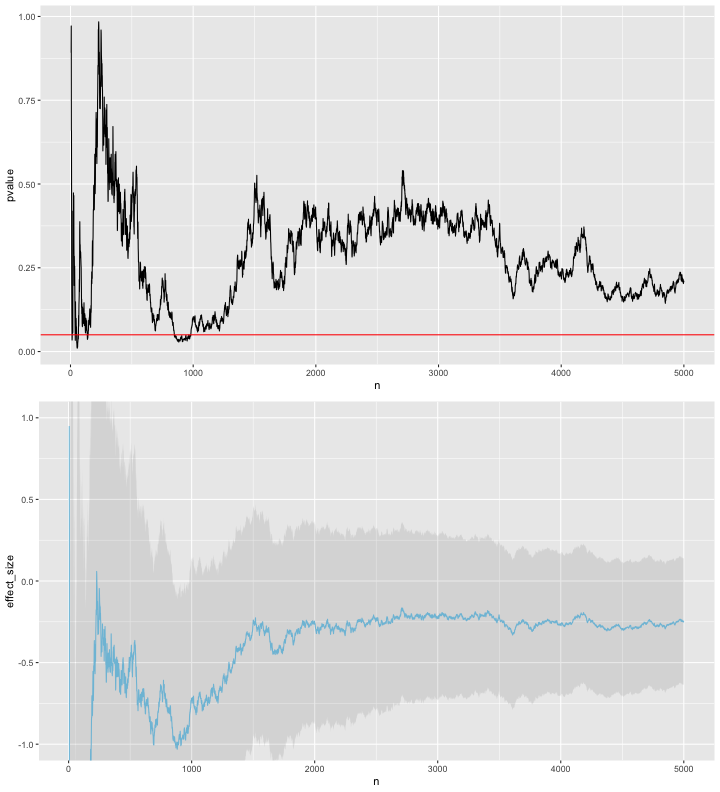
Note in the plot above that both the effect size estimates and p-value are fairly erratic.
Distribution of minimum p-value
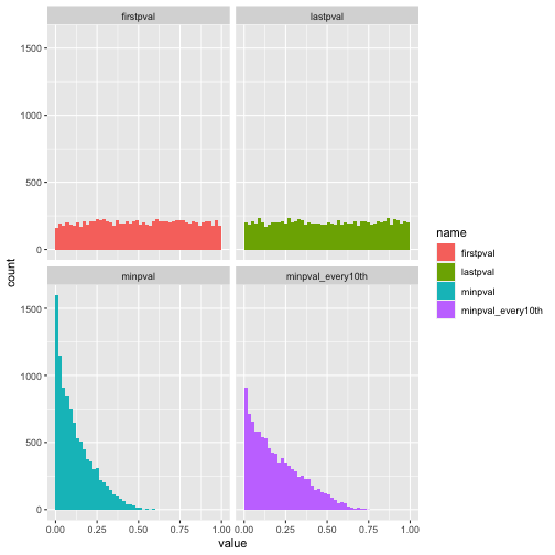
Suppose we repeated the p-value calculation after every sample as above, and at the end reported only the minimum p-value we found. This isn’t quite the scenario stated above, which is rather ‘we repeated p-value calculation after every sample, and we stopped experiment as soon as p was below 0.05’, but it helps to illustrate the issue I think.
In each simulated experiment, I have sampled 100 pairs from the same distribution as before, i.e. high variance, no true difference between distributions, and I have calculated the p-value of the t-test after each sample pair is added (starting only after the 5th sample pair). I simulated 10,000 versions of this experiment.
set.seed(13)
generate_results <- function(numTrials, numSamples) {
  replicate(numTrials, performTests(0, 10, numSamples)$pvalue)
}
many_trials_pvals <- generate_results(10000, 100)
For inferences based on p-values to be valid, we need it to be the case that when the null distribution is true, p-values are distributed uniformly on the interval [0, 1]. This is the case if we look at the distribution of the p-values obtained after looking at only the first 5 pairs, and after looking at all 100 pairs, as in the first row of the plot below.
However, if we instead for each experiment calculate the minimum of the 96 p-values calculated during the experiment and look at the distribution of these minimums, we see that the distribution is no longer uniform. Even if we calculate the p-value only after every 10 samples collected (as in the lower right plot), the distribution is far from uniform.
summarised <- data.frame(firstpval=many_trials_pvals[1, ],
                         lastpval=many_trials_pvals[nrow(many_trials_pvals), ],
                         minpval=apply(many_trials_pvals, FUN=min, MARGIN=2),
                         minpval_every10th=apply(many_trials_pvals[seq(6, 96, by=10), ], FUN=min, MARGIN=2),
                         minpval_every30th=apply(many_trials_pvals[seq(26, 96, by=30), ], FUN=min, MARGIN=2))
ggplot(pivot_longer(summarised, cols=1:4), aes(x=value, fill=name)) +
  geom_histogram(binwidth=0.02, boundary=0) +
  facet_wrap(~name) +
  scale_x_continuous(limits=c(0,1))
Since the null distribution is true here, any ‘positive’ result (in the naive sense just looking at p-values we would call an experiment ‘positive’ if the p-value we calculate is below 0.05) is a false positive. Here I show the false positive rates for the different methods: (1 - firstpval) look only at the p-value after 5 samples, (2 - lastpval) look only at the p-value after all 100 samples, (3 - minpval) look at the minimum p-value across the whole experiment, calculating p-values after every new sample pair collected (4 - minpval_every10th) look at the minimum p-value across the whole experiment, calculating p-values only after every 10 sample pairs collected, (5 - minpval_every30th) same as previous but calculating after every 30 sample pairs collected.
Unsurprisingly, the false positive rates for checking only a single p-value are roughly the threshold we used to define significance, that is to say that both have false positive rates of roughly 0.05. However, the minimum p-value methods have far higher false positive rates. The false positive rate for the minimum over calculations after every new sample is clearly unacceptable, but even if we only perform 3 calculations (recalculate after every 30 samples) the false positive rate is still twice as high as using a single p-value.
apply(summarised < 0.05, 2, mean)
##         firstpval          lastpval           minpval minpval_every10th minpval_every30th
##            0.0441            0.0485            0.3214            0.1962            0.1090
Attempted multiple testing correction
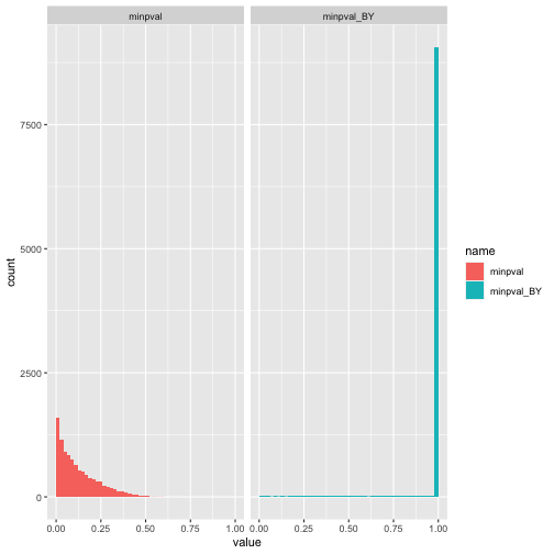
As discussed above, this is because we are essentially performing multiple tests and failing to correct for this. Here is the distribution after correction for multiple testing (for each experiment) and then after taking the minimum for each experiment. I can’t quite explain why there is such a high spike at 0 after this correction. I suppose it means that the adjustment is overly conservative.
min_after_adjusting <- function(pval_list) {
  return (min(p.adjust(pval_list, method="BY")))
}
summarised <- data.frame(minpval=apply(many_trials_pvals, FUN=min, MARGIN=2),
                         minpval_BY=apply(many_trials_pvals, FUN=min_after_adjusting, MARGIN=2))
ggplot(pivot_longer(summarised, cols=1:2), aes(x=value, fill=name)) +
  geom_histogram(binwidth=0.02, boundary=0) +
  facet_wrap(~name) +
  scale_x_continuous(limits=c(0,1))
Sources
Alex Reinhart discusses this idea in Chapter 9 of his book ‘Statistics Done Wrong’.
Szucs, Denes. 2016. ‘A Tutorial on Hunting Statistical Significance by Chasing N’. Frontiers in Psychology 7 (September). https://doi.org/10.3389/fpsyg.2016.01444
Halsey, Lewis G. 2019. ‘The Reign of the P-Value Is over: What Alternative Analyses Could We Employ to Fill the Power Vacuum?’ Biology Letters 15 (5): 20190174. https://doi.org/10.1098/rsbl.2019.0174